Wednesday, 27 January 2016
Equipment
Borrowed instruments that we will use in our music video.
In the music department there are a few drum kits, however we chose this beaten up one as it fits with our grungy theme
Logo Design
This is our chosen logo design. From looking at other real life bands logos we wanted to stick to a minimalistic look. The logo is simple and straight to the point, it states the name of the band and is typed in an eye catching font. The font is rough. This resembles the style of music that our band plays, rough and bold rock tracks.
Friday, 22 January 2016
Animatic
Using sketches from our story board we have created a rough draft animatic that sets out our plans for our music video.
Thursday, 21 January 2016
Casting
These casting members are our first choice actors, however we still need to take some test shots of them in their roles to see if they look believable.
Lead Singer: Barney Bass Guitar: Alan
Friday, 8 January 2016
Shoot Planning
Wednesday 20th Feb
- Start doing practice shots in the hall
- Take casting shots of the band
- Possibly start taking pictures for the ancillary task
Wednesday, 6 January 2016
The 1975 Album cover analysis


The 1975 use a very minimalist design in all of their album and single covers. They use their signature box design and 'The 1975' in the centre. The covers feel nostalgic and have a retro feel about them, which appeals to their target audience.
Digi-Pak research
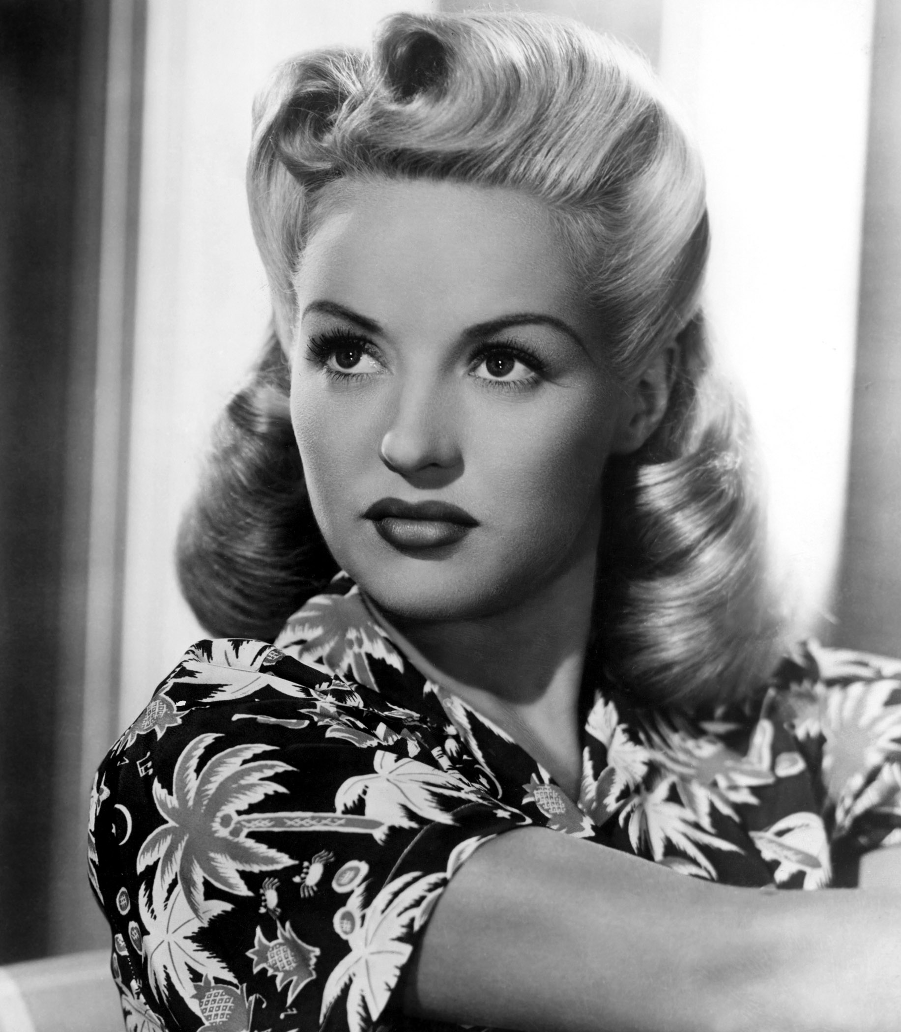
P!NK album cover -
- Stars around her head references Paramount Pictures (Intertextuality)
- Backdrop includes tattoos which represent rebellion
- Roses and the text is similar to that on Guns and Roses album covers (Intertextuality)


- Exclamation in her name references her loud style.
- Betty Grable styled hair (40's)

- 40's Pin up referencing
Subscribe to:
Posts (Atom)


.svg/1254px-Paramount_Pictures_print_logo_(1968).svg.png)